Several weeks ago, I met with a new client for a design consultation, and she was in a conundrum. Her wedding is going to be very formal, but she really wants an invitation filled with color and printed with her wedding motif. She was concerned that a colorful, highly designed invitation would not convey the formality of her wedding.
While it is true that in days past formal invitations were very straightforward – black text printed on white or ivory cards with few accents or design work – that isn’t the case today. Formal invitations can be just about anything you want them to be. However, there are a few guidelines that will help your guests understand that your event will be formal.
TYPESTYLE
Typestyle can be the first indication of what to expect at an event. While there aren’t hard-and-fast rules, and anything is possible within the world of design, here are a few tips for choosing the typestyle of your invitation.
Serif fonts (think Times New Roman-style), also called block fonts, are very traditional, and work best for very formal weddings. Consider pairing a block font with a traditional script font and you’ve got a very classic, formal typestyle.
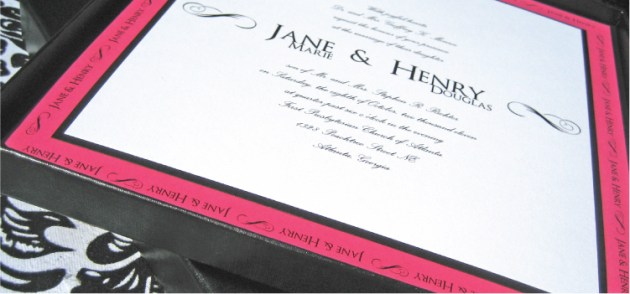
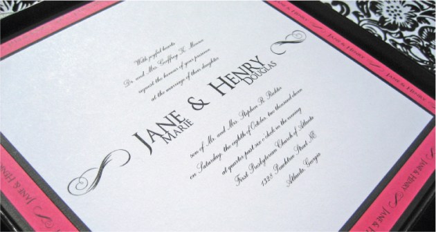
In the photos above, for instance, I used a classic all-caps block font with a traditional script font. To make it more interesting, I switched the usual roles of the fonts: I used the block font for the bride and groom’s names, and the script font for the invitation text. (Note: When using script fonts for invitation text, be sure to choose a script that’s easy to read, and be sure to print it a little larger that you might print a block font. Remember, one of the most important “etiquette” rules is ensuring that you make things easy for guests. It’s not all about eye-candy!)
On the other hand, a script font that verges on modern “handwriting” tells guests that the event will be less formal, perhaps even casual. This type of font is best used for less formal weddings, outdoor weddings, beach weddings, or destination weddings. Sans serif fonts – those without the little nubbies on the ends of the letters (think Arial- or Verdana-style) – are also great for informal events, but depending on their usage, they can also be used for a formal wedding with a contemporary look and feel.
WORDING
Wording is the second major indicator of the formality of your wedding. If you’re planning a formal wedding, it’s best to stick with traditional wording and leave out additional text like rhyming lines. Also, be sure to spell out all words, even numbers, and do not use abbreviations.
Did you know that technically, wording varies based on whether you’re being married in a religious setting. For instance, if you’re being married in a church, the wording: “requests the honour of your presence” is appropriate. If you’re having a civil ceremony, the wording: “requests the pleasure of your company” is appropriate.
For less formal wedding invitations and casual invitations, wording can literally be whatever you’d like it to be, as long as the who, what, when, where, why information is being given. Abbreviating dates is perfectly acceptable if you choose to do so, and will often help convey the fun and casual nature of your event.
ADDITIONAL LINES
If your event is black-tie, it is acceptable to print “Black tie” or “Black tie optional” in a lower corner of the invitation or below the invitation text. Likewise, if you’re having a beach wedding and you don’t want guests wearing heels, consider printing “Casual attire” in the corner. Doing so will give your guests official “permission” to dress down.
So… now that you have a few general guidelines, go for it – mix some fun, color, and unexpected elements into your formal wedding invitation!
And above all else, remember: the most important thing to keep in mind – not just for your invitations, but for all aspects of your event – is to make things easy and fairly obvious for guests. Convenience and conveyance of information is the real reason behind etiquette rules, afterall.
Boxed Invitation: Dogwood Blossom Stationery & Invitation Studio, LLC
The formal wedding invitation above was created in a black and fuchsia color scheme, accented with arabesques. It is an oversized, 8.25” x 8.25” invitation with multiple layers of textured black, toothy whites, and smooth fuchsia. This invitation is mailed in a black slimline invitation box and will arrive to guests in stunning style.


Thanks for the tips on font style! It makes sense that it can set the tone of the wedding. I never thought about it like that before.