{Real Wedding} Mackenzie & Eric's Rustic Country Wedding in Colorado

Just a very quick post today!  I wanted to share a few photos of the paper goods from a really amazing wedding!  I had the pleasure of designing and creating the “winter-country-rustic” invitations and paper goods for Mackenzie and Eric, who were married in Colorado in January.  Their photography, Suzanna March Photography, was so kind to send me photographs she took of their paper goods.  But you also really, really need to see the whole wedding on Suzanna’s website here.  Theirs was a tremendously unique and personal wedding!

Here we go:

Winter Country Rustic Wedding Invitation

Winter Country Rustic Wedding Invitation

Winter Country Rustic Wedding Program with buffalo plaid

Winter Country Rustic Wedding - escort cards

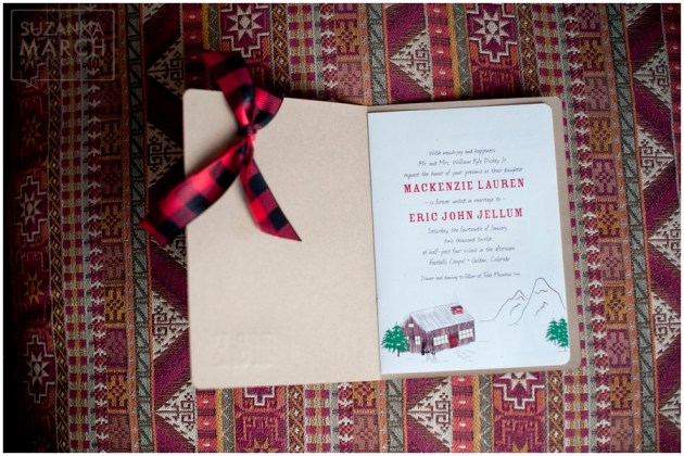
To create these paper goods, I actually worked not only with Mackenzie, but with her mom.  They told me the focus would be a little bit country, a little bit rustic.  They were planning to incorporate red buffalo plaid, “kraft” brown, and evergreens into the wedding, so I kept that in mind as I created the paper goods.  We ended up with a booklet-style wedding invitation with hand-sewn binding.  The light brown woodgrain cover of the invitation was letterpressed with “M&E” – the couple’s monogram.  The pages inside contained whimsical images of a snow-covered cabin in the mountains, evergreen trees, cowboy boots, and skis.  Since the wedding was being held in Golden, Colorado, Mackenzie also wanted to feature the archway sign to the city, so we included that, too!

For the ceremony and reception accessories, we continued using the same motifs – red buffalo plaid, cowboy boots, and evergreen trees, printed on speckled creamy white papers with kraft brown accents peeking out.  The escort cards used motifs to indicate each guest’s entree selection, which added lots of color, fun, and interest.

Again, I insist that you go here to see the whole story of Mackenzie and Eric’s wedding!

Thank you, Mackenzie and Eric, for letting me be a small part of your big day!

Photographer:  Suzanna March Photography

Wedding Invitation, Program, and Escort Cards:  Dogwood Blossom Stationery

{Corporate Event} Bright Orange and Cream Anniversary Invitations

Orange and cream white corporate custom-designed pocket invitation

I was thrilled to hear from Cessy Meacham recently when she contacted me about creating an invitation ensemble for a big bash celebrating the 5-year anniversary of her travel agency, Anytime Travel Solutions.  I worked with Cessy several years ago on her first-year anniversary invitations, so I was very aware that this busy lady knew how to celebrate in style!  This time around, though, she was doing it even bigger, with multiple events taking place over a weekend, and she wanted to host several of her out-of-town clients at a local bed and breakfast, as well.  So we created several invitation iterations which allowed her to invite different guests to the events meant for them.  Here’s a snapshot:

Orange and cream white corporate custom-designed pocket invitation

Orange and cream white corporate custom-designed thank you card and invitation

Orange and cream white custom-designed corporate anniversary invitation

Anytime Travel Solution’s colors are orange and gray, and one of their many specialties is travel to Italy and the Mediterranean, so Cessy asked to use the Florence coat of arms on the invitation.  We incorporated the design into a bright but sophisticated orange and creamy-white invitation.  The main invitation for her out-of-town guests is a long, folding pocket invitation, printed with their logo and a column of the Firenze design on the cream cover.  It opens to reveal the orange interior, the invitation, and a pocket containing pertinent information.  Additional invitations were created for local guests, inviting them to her ribbon cutting celebration and a special dinner.  We chose matching orange envelopes, with return address printed in dark gray on the back flap.

Congratulations to Cessy and the team at Anytime Travel Solutions on 5 years of stellar service!  And thank you for asking Dogwood Blossom Stationery to be a part of your celebration!

Are you planning a milestone event for your business? Need invitations that reflect the scope of the celebration?  Dogwood Blossom Stationery can help you with that.  Contact us here.

{Showcase Event} “Modern Preppy” Lime and Navy Invitations

Lime green and navy blue wedding invitation in silk box

Lime green and navy blue wedding menu and seating card

Bright green and dark blue wedding menu and escort card

Green and blue Modern Preppy tablescape

Lime and blue wedding invitation with embroidered monogram on ribbon

Modern Preppy wedding tablescape; lucite chairs

Green and blue wedding cake

Several months ago, I had the great pleasure of being asked by Karry Castillo of Uniquely Yours to create invitations and paper goods for her “Modern Preppy” tablescape (one of 3 unique themes) that she would be showcasing at the Bridal Ball held on March 2, at the Lake Mary Events Center.

As is typical for a wedding stationer, though, I didn’t have a chance to attend the actual event, and therefore wasn’t able to see how my pieces “fit” into the bigger picture.  Well, yay for photographers!  Karry kindly connected me to Chad Pilster of Pilster Photography, who sent me photos of the event.  And…  Oh.my.goodness!

I just love the vision Karry had for this tablescape!  She is so unbelievably talented and I am just so impressed by her.   So here’s the super-talented team she assembled for this particular tablescape:

Concept and design:  Uniquely Yours

Photography:  Pilster Photography

Floral design:  Lee Forrest Design

Table and chair furnishings:  AFR Room Service

Linens and tabletop decor: Kirby Rentals Orlando

Cake:  Something Sweet Cake Studio

And invitations and paper goods, you guessed it:  Dogwood Blossom Stationery & Invitation Studio

For this table, two wedding invitations were created.  The first is a square, layered invitation with two lines of white grosgrain ribbons, packaged neatly in a 100% silk box in bright lime green.  This invitation features a lime green lattice pattern, which is reflected on the inside of the coordinating wedding programs, and on some of the seating cards.

The second invitation uses a lime green and navy blue plaid pattern and features a wide, white grosgrain ribbon custom embroidered with a monogram in navy blue thread.  The plaid pattern on this invitation was also carried through to the program and escort cards.

Thanks Karry, for letting me be part of this event!

{Real Event} Blue and Yellow Polka-Dotted Fundraising Dinner Invitations

Blue_Yellow_Gray_Invitation

Navy blue and banana yellow invitation with gray ribbon

Whew, it’s been quite a month!  Things are starting to fall into a more manageable pace again.  I’ve been dying to update this blog, so I’m going to start with one of my more recent projects – fundraising dinner invitations for the Gaining Life Initiative Foundation (GLI).

GLI is focused on increasing knowledge and supporting research of brain tumors, specifically glioblastoma multiforme.  In collaboration with the University of Alabama Birmingham, they’re hoping to find a cure for this aggressive brain tumor.

I was so excited when GLI contacted me about working with them on this project.  Their needs for their Dining Out for a Cure fundraising event were fun invitations in a dark blue and bright yellow color scheme that incorporated a gray Brain Cancer ribbon.  You might remember Rita and Franck’s wedding invitation?  And you might also remember the yellow and gray polka-dot inspiration post?  Well, combine those two and add a hand-sewn gray ribbon and what do you have?  The perfect invitation for GLI’s Dining Out for a Cure event!  Take look at their website and tell me if I’m wrong.

We created a layered invitation using textured sapphire blue cardstock, bright banana yellow cardstock, and bright white.  We then added a few lines of yellow polka-dots at the bottom, the GLI logo, and a hand-sewn light gray ribbon.  We added an rsvp card that allowed guests to send a check if they weren’t able to attend the event.  The goal was to create an invitation that left donors counting the days until the event, and to create excitement about and interest in the research GLI is conducting.

Thanks GLI for letting me be a part of your fundraising event!

If you’re interested in supporting this important cause, you can make contributions on their website here.

Fundraising Invitation: Dogwood Blossom Stationery & Invitation Studio

{Real Event} Nathan’s Vintage Travel Bar Mitzvah

Nathan loves the idea of travel and seeing new things, so his “Travel in the 1940s” theme for his Bar Mitzvah was a good fit.  At his reception, each of the 10 tables contained a unique-themed centerpiece from Israel, France, Egypt, the US, Italy, Brazil, Canada, Mexico, Greece, or England.  He and his family spent months before his big day collecting props and souvenirs from each of those countries to decorate the reception hall.  Nathan and his dad also custom-built table centerpieces of a sphinx, an Egyptian pyramid, and the Eiffel Tower.   While friends and family contributed a lot of the props from their own collections, Nathan’s mom was surprised to find that they already had a lot of vintage souvenirs and travel-related items at home.  They scoured local thrift stores for the pieces they couldn’t find at home or at a friend’s home.  Every decor detail was covered!

As part of his Bar Mitzvah, Nathan requested that guests bring canned goods and non-perishable food items for donation to a local food pantry.  To tie in with both his vintage luggage and the donation of grocery items, Nathan offered reusable grocery bags that were screenprinted with a globe to each guest as party favors.

When I met with Nathan and his family to discuss his 40s-travel-themed invitations for his upcoming Bar Mitzvah, I was impressed by his knowledge of other countries and their cultures.  Nathan wanted his invitation to look like a vintage suitcase loaded with travel stickers, so we made a folding invitation using brown cardstock that opened like a suitcase.  The “suitcase” contained stickers from his 10 chosen countries, and a luggage tag announcing, “Traveling to:  Nathan’s Bar Mitzvah.”  Because the family had planned an entire weekend of events, we chose to use the space inside the suitcase to mimic a train ticket and itinerary, complete with travel stamps.  For the reception, we created special guest book pages to be placed at each table and then combined into a book after the event.  Each guest book page contained a different country sticker from the “suitcase” as well as other cultural references from that country.  Guests were given colored pencils to leave Nathan their message, drawings, and wishes of good luck.

In addition to his pride in becoming a man and the years of studying and work that led to his becoming a Bar Mitzvah, Nathan’s favorite things surrounding his day included all the planning details.  He had a really good time working with his dad to build centerpieces, and working with the baker to design his cake and choose his flavors.

Thank you, Nathan, for letting Dogwood Blossom Stationery be part of your Bar Mitzvah!

Traincase display with party favorsTrain ticket and vintage suitcase Bar Mitzvah invitationNathan, an old typewriter, and a suitcase cakeCountry-themed centerpieces at every table

Photography:  Friends of the family

Centerpieces:  Nathan & Family

Invitations & Guestbook Pages:  Dogwood Blossom Stationery & Invitation Studio

Cake:  Heavenly Bake Shoppe, Cocoa Village, FL

Real Wedding: Rita & Franck’s Sapphire Blue and Lemon Yellow Wedding

Rita and Franck’s wedding day in October at LPGA International was full of special touches and attention to detail.  As the couple are French, as were some of the guests, they chose lots of classic French detail, such as a fleur de lis motif, a croquembouche wedding cake, and even a Bible verse printed in French on the invitations being sent to French-speaking guests.

Rita and Franck chose a color palette of lemon yellow, used for flowers and decor, against a sapphire blue backdrop.  I love Rita’s decision to incorporate real lemons and lemon halves into the centerpieces and decor.  I’m betting their reception smelled wonderful!  They worked in the fleur de lis motif where possible, on printed paper goods and on the seating card holders.

A croquembouche was served as the wedding cake, as is traditional for French weddings.  Gorgeous all by itself – created by mounding profiteroles into a cone and dripping it with sweets – it was made even more spectacular with flowers and curled lemon-zest decoration worked into the tower.  Rita also gave Franck a sweet surprise with a really lovely groom’s cake decorated with the Arsenal Football Club logo in fondant!

Dogwood Blossom Stationery created a fairly traditional, layered wedding invitation for Rita and Franck.  Rita chose pearlized dark sapphire blue paper paired with matte lemon  yellow.  We accented the invitation with a small fleur de lis  in the perfect middle.  Square table numbers were created using the same papers and motif for the couple’s reception.  And because Rita and Franck wanted to give something special and personalized for their wedding favors, we created custom recipe cards using the couple’s favorite family recipes.

What a beautiful wedding!  Thank you, Rita and Franck, for letting me be part of you day!

PS – You can see a few more photos of Rita & Franck’s day on the With This Ring blog here.

Sapphire & Lemon Yellow Fleur de Lis Wedding Invitation

Rita & Franck

Buttercream Yellow Aisle Ribbon

Sapphire & Lemon, Fleur de Lis, Table Number

Blue Fleur de Lis Recipe Card Favors

Croquembouche Wedding Cake & Arsenal Football Grooms Cake

Photography:  Jen Adams Photography

Venue:  LPGA International, Daytona Beach, Florida

Planner:  With This Ring, Inc.

Wedding Cake:  The Pastry Studio

Wedding Invitations, Table Numbers, & Recipe Favor Cards:  Dogwood Blossom Stationery & Invitation Studio

Are you planning a uniquely detailed wedding like Rita and Franck’s?  Need help finding the perfect invitation to go with  your color scheme or theme?  Click here.

Thanks for commenting and sharing this post!

Real Wedding: Amy & Ed’s Beach Wedding

With their families and friends spread out across the US, Amy and Ed put some thought into where they might have their wedding.  Finally it hit them: why not get married in their own backyard?  Amy and Ed live within walking distance of the beach where they were married in Cape Canaveral, Florida.

When I first met with Amy and Ed to discuss their wedding invitations, they hadn’t yet decided on a color scheme.  After browsing through paper swatches and considering the possibilities, they decided on a steel-and-champagne color palette for their invitation and paper goods.  These colors worked well with Amy’s creamy white layered wedding dress and Ed’s sandy linen suit.  Their final invitation combined perfectly smooth pearlized steel cardstock with the natural textures of Japanese lace paper and eco-friendly twisted-paper ribbon in shades of creamy ivory.  Inside, a light champagne liner displayed a custom map to the beach and shuttle information for guests to travel between the beach and reception.  Considering their setting on a Florida beach in July, we also created wedding programs that doubled as fans.

Their marriage took place on the beach near the dunes, under an arch adorned with white lilies and starfish and surrounded by mini palms.  Seashells with the couple’s name and wedding date were passed to guests after vows were made, and the entire party walked to the water’s edge, wished Amy and Ed well, and tossed their shells into the sea.

For the reception, Amy and Ed chose a second palette of bright oranges, yellows, and greens – perfect to gear up guests for the big bash that followed.  Centerpieces and table settings reflected this bright color scheme.  Favors consisted of margarita glasses (for use at the margarita bar) and cello bags of candy tied with favor tags that doubled as seating cards.  Amy and Ed opted for an extensive surf-and-turf buffet and a large selection of gourmet cakes in lieu of one single wedding cake, so we also created coordinating buffet cards with descriptions of each menu item.

Amy and Ed’s wedding incorporated things that are important to them: a setting that reflected the home they share, supportive and loving family and friends, an intertwining of comfort and elegance, and a love that will last a lifetime!  Thanks Amy and Ed, for letting me be a part of your day!

Wedding Date Seashell on the BeachSteel Gray & Ivory Wedding Invitation

Ed & Amy's Cape Canaveral Beach Wedding

Beach Wedding Good Luck Shell Toss

Steel gray & ivory wedding program fan, thank you, and buffet card

Photography:  Michael Howard of Cocoa Beach Photography (All photos except of invitation, thank you card, and buffet card.)

Planner/Officiant:  Beach Weddings by Joanie

Invitation, Buffet Cards, Thank Yous, and Wedding Programs:  Dogwood Blossom Stationery & Invitation Studio, LLC

Venue:  Cherie Down Beach, Cape Canaveral, Florida

Are you planning a highly personalized wedding like Amy & Ed?  Still looking for those perfect invitations?  Contact me here.

Remember to leave  your comments and feedback, and share this with your friends!

Real Wedding: Katie & Chad’s Blueberry Wedding

Before their engagement, Katie and Chad took their first trip to Maine together.  There, they fell in love with many things: a long bicycle trip around a lake, the beautiful landscape, and most importantly, the blueberries.  They ate blueberry pancakes at breakfast each morning and shared blueberry ice cream in the afternoons.  They even sent blueberry preserves home to friends and family.

A few months later, Chad popped the question during a quiet evening at home.  Remembering the fun and adventure they had on their trip to Maine, they wanted to incorporate some part of it into their wedding.  Knowing that they wanted an outdoor wedding, something simple and elegant with a country flair, at a venue with beautiful architecture, they felt that blueberries fit the bill.

Katie and Chad had an August wedding at the Historic Mankin Mansion in Richmond, Virginia.  They chose this venue because it had the perfect mix of indoor and outdoor space, and the architecture of the mansion was the perfect backdrop for their plans.  As a bonus, since the mansion is a bed and breakfast, friends and family were able to stay there and enjoy an entire weekend of celebration.

Included in Katie’s favorite wedding decor were all simple but elegant items: hanging baskets, simply cut hydrangeas easily arranged in antique milk bottles (collected over many months by the couple themselves!), a sign made by the groom using a piece of driftwood, the handmade custom paper accessories that adorned the outdoor ceremony and tented reception, and her specially-baked blueberry-streusel muffin wedding favors.

When Katie and Chad brought their inspiration of using blueberries throughout their custom wedding invitation and paper goods to Dogwood Blossom Stationery, I was excited to get started.  They choose a pearl-like opal blue paper for the invitation, paired with white cardstock and white grosgrain ribbon.  To make things easy on guests, they asked for a custom map to the weekend venue driving from each direction.  In order to accommodate the map, we created a square, folding wedding invitation that opened on the right to reveal the invitation itself and then flipped up to reveal the map and directions.  In the end, three different blueberry motifs were designed to adorn the various handmade paper pieces: wedding invitation, response enclosure, seating cards, and table numbers.

Katie & Chad's Blueberry Wedding

Blueberry Wedding Invitation

The Historic Mankin Mansion

Blueberry motif table number, hydrangeas, milk bottle

Blueberry Wedding Kiss

Blueberry Wedding Seating Cards

Venue:  The Historic Mankin Mansion, Richmond, VA

Photographer:  Andy Pigsley Photography
(All photos except the invitation)

Invitations, Table Numbers, and Seating Cards:  Dogwood Blossom Stationery & Invitation Studio

So this is my very first post on my brand-new blog!  How’d I do?  Please leave your comments below and share this with your friends.  And visit again soon to see other real weddings, invitation inspiration, custom invitation ideas, and color palettes!