{Real Wedding} Jessica & Adam's wedding featured in Space Coast Bride & Groom mag!

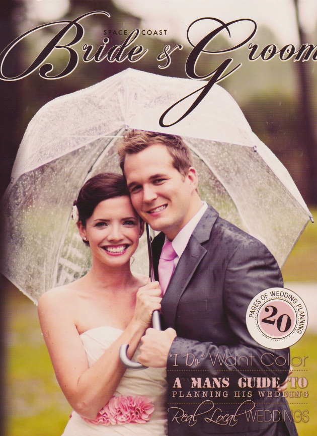
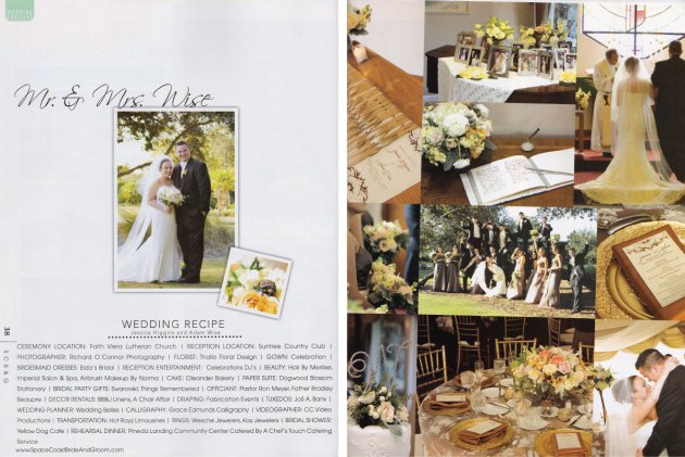
So excited to share with you the big news of one of our newlywed couples, Jessica & Adam, having their wedding featured in Space Coast Bride & Groom magazine!  As you can see below, their October 22nd wedding was gorgeous!

Space Coast Bride & Groom MagazineSpace Coast Bride & Groom Magazine

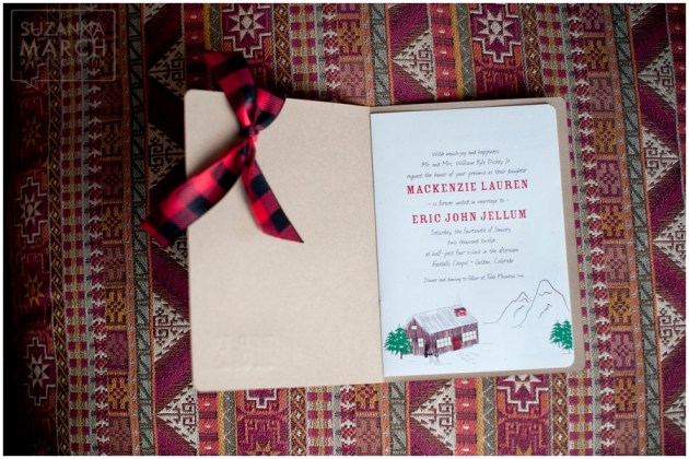
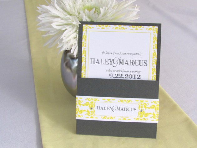
Jessica and Adam chose a palette of pale gold, caramel, and ivory for their wedding invitation and paper goods.  Delicate lace and classic timelessness were major pieces of their vision, so we created a folding invitation (below) with an ivory lace overlay and satin ribbon.  We added a letterpress monogram to the front and a topaz crystal.  Inside, their invitation is letterpressed in caramel and enclosures are contained within a band.  A custom-designed scroll-and-flourish motif adorned all pieces of the invitation ensemble.  Breathtaking calligraphy by Grace Edmands Calligraphy put the final touches on this truly luxurious invitation.

Lace letterpress wedding invitation in ivory, gold, and caramel

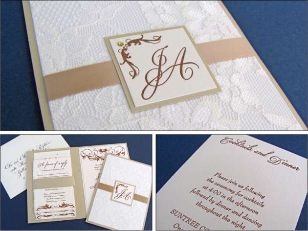
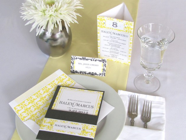
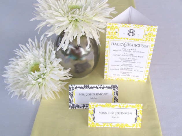
We then carried the color scheme, design, and style from the invitation into their ceremony and reception papers.  Their wedding programs contained the same satin ribbon as was used on the invitation, and the menus, escort cards, and table cards contained coordinating motifs and scrollwork.

Thanks Jessica & Adam for letting Dogwood Blossom Stationery be a small part of your big day!  And congrats on having your wedding featured in Space Coast Bride & Groom!

Jessica & Adam’s vendors include:

Reception:  Suntree Country Club

Planner:  Wedding Belles

Photography:  Richard O’Connor Photography

Florist:  Thallo Floral Design

Cake:  Oleander Bakery

Decor:  BB&J Linens and A Chair Affair

Calligraphy:  Grace Edmands Calligraphy

Invitations & Paper Goods:  Dogwood Blossom Stationery

And a major special thanks to Jessica & Adam’s rehearsal dinner caterer, A Chef’s Touch Catering, for helping me obtain a copy of this issue of Space Coast Bride & Groom so I could share this wedding with all of you!


{Real Wedding} Mackenzie & Eric's Rustic Country Wedding in Colorado

Just a very quick post today!  I wanted to share a few photos of the paper goods from a really amazing wedding!  I had the pleasure of designing and creating the “winter-country-rustic” invitations and paper goods for Mackenzie and Eric, who were married in Colorado in January.  Their photography, Suzanna March Photography, was so kind to send me photographs she took of their paper goods.  But you also really, really need to see the whole wedding on Suzanna’s website here.  Theirs was a tremendously unique and personal wedding!

Here we go:

Winter Country Rustic Wedding Invitation

Winter Country Rustic Wedding Invitation

Winter Country Rustic Wedding Program with buffalo plaid

Winter Country Rustic Wedding - escort cards

To create these paper goods, I actually worked not only with Mackenzie, but with her mom.  They told me the focus would be a little bit country, a little bit rustic.  They were planning to incorporate red buffalo plaid, “kraft” brown, and evergreens into the wedding, so I kept that in mind as I created the paper goods.  We ended up with a booklet-style wedding invitation with hand-sewn binding.  The light brown woodgrain cover of the invitation was letterpressed with “M&E” – the couple’s monogram.  The pages inside contained whimsical images of a snow-covered cabin in the mountains, evergreen trees, cowboy boots, and skis.  Since the wedding was being held in Golden, Colorado, Mackenzie also wanted to feature the archway sign to the city, so we included that, too!

For the ceremony and reception accessories, we continued using the same motifs – red buffalo plaid, cowboy boots, and evergreen trees, printed on speckled creamy white papers with kraft brown accents peeking out.  The escort cards used motifs to indicate each guest’s entree selection, which added lots of color, fun, and interest.

Again, I insist that you go here to see the whole story of Mackenzie and Eric’s wedding!

Thank you, Mackenzie and Eric, for letting me be a small part of your big day!

Photographer:  Suzanna March Photography

Wedding Invitation, Program, and Escort Cards:  Dogwood Blossom Stationery

{Inspiration} Yellow and Graphite Damask Wedding Suite

Yellow and graphite damask wedding invitation, menu, table number, and escort cards

Yellow and graphite damask wedding invitation
Yellow and graphite damask wedding reception menu, table number, and escort cards

Yellow + gray is such a versatile color combination, both in terms of formality and season.  It is equally appropriate for an informal backyard summer wedding as it is for a black-tie ballroom wedding in January.  The tricks to this color scheme in tending it one way or the other are your choice of graphic design, wording layout (as well as wording itself), and typestyle.

The above paper suite contains a simple, pocket-style wedding invitation of graphite accented with a yellow damask fixed band with Swarovski crystals.  The invitation is printed on white with a yellow damask backing.  The white mailing envelope is lined with a matching custom yellow damask envelope liner.

The escort cards above have two colors to indicate meal option at the reception – gray damask is one entrée, yellow damask is the other.  All escort cards contain crystals as well.

The wedding menu above doubles as a table number and is three-sided, self-standing, printed fully in yellow damask, with table number and menu information on all three sides.

Yellow and Stone Gray Polka Dot Boxed Wedding Invitation with hand-sewn fabric flower

Yellow, gray, and white polka dot escort cards for wedding

And here, we have another example of yellow and gray wedding papers – a wedding invitation in a suede-like gray fabric box.  The box is adorned with a wide, bright yellow grosgrain ribbon and a hand-sewn flower made with yellow striped cotton fabric.  The invitation itself has yellow polka dots.

The seating cards for this invitation are double-sided and mimic the yellow polka dots from the invitation.  Guests’ names are printed on one side, and their table number is shown on the back.

For more yellow and gray wedding inspiration, visit my Pinterest board here.

All invitations, escort cards, menus, and table numbers shown are created by Dogwood Blossom Stationery.  Contact us to schedule a design consultation for your custom yellow and gray event!

{Inspiration} Sequins – More sequined wedding invitations

Eggplant purple wedding invitation with sequins

Sequins are hot right now.  They’re everywhere.  While prior to 2011 most of us might have remembered them mostly as adornment on our gymnastics and dance leotards from childhood (I remember!), they were rethought last year as a hot embellishment for literally just about everything – couture runway gowns, home décor, hair accessories, you name it.  The wedding industry was certainly not left out of that trend, as you are probably already very aware.  And it’s a good thing, because sequins can do marvelous things for your wedding’s overall look and style, and they’re actually much more versatile than most of us give them credit for.

BLING – Used in large quantities and metallic colors,  sequins provide a lot of bling to whatever item it is they’re embellishing.  Consider adding crystals to boost the bling.

VINTAGE GLAMOUR – Used in delicate, pale, or washed-out hues like champagne, peach, or light gray, they lend a vintage glam look.  Perfect for weddings with a vintage Hollywood theme.

WILD FUN – In bright or hot colors, sequins add fun to their platform.

SOPHISTICATION – And used sporadically, in smaller quantities and rich colors, they add elegance, dimension, and intensity of color as they reflect the light they catch.

Pale gold and blush pink wedding menus with sequins


We created the wedding invitation at the top of this post using a suede-like aubergine purple fabric, embroidered with an undulating wave pattern and embellished with matching eggplant-colored sequins.  This wedding invitation is more sophisticated than it is blingy as a result of the rich purple hue and the relatively minimized use of sequins.  If you could only reach through the screen and touch it, you would find this invitation incredibly tactile and warm, thanks to the soft faux suede fabric and raised embroidered waves.

We created the place-setting menus above using cream-colored papers printed in chocolate brown.  Blush pink sequins and tiny, clear glass beads were sewn into a twist of pale gold mesh fabric as an embellishment.  These menus have a vintage feel with the slightest hint of glam.

What’s your take on sequins?  Will you incorporate them into your wedding style?  Contact us at Dogwood Blossom Stationery to schedule a design consultation to discuss your custom sequin wedding invitations.

{News} We've been featured in BRIDES magazine!

Big news!  How exciting!  What an honor!  Our plum and jade sequin wedding invitation was featured in the January 2012 issue of BRIDES magazine!  See it online here, too.

Plum purple and jade green invitation by Dogwood Blossom Stationery, featured in BRIDES magazine Jan 2012.

This invitation is printed in purple and green on matte white, then layered onto metallic plum purple.  It uses an informal font set and a contemporary line-and-dot design on the left side.  The design on this wedding invitation is adorned with five Swarovski crystals and nine jade green sequins were sewn onto this invitation by hand.  Enclosures are printed on matte white using a coordinating purple and green line-and-dot design.  White mailing envelopes are lined with a custom envelope liner.

Plum purple and jade green wedding invitation with crystals and sequins

Plum purple and jade green wedding invitation with crystals and sequins

Sequins are hot-hot-hot right now.  Do you want your wedding invitation to contain sequin elements?

{Showcase Event} “Modern Preppy” Lime and Navy Invitations

Lime green and navy blue wedding invitation in silk box

Lime green and navy blue wedding menu and seating card

Bright green and dark blue wedding menu and escort card

Green and blue Modern Preppy tablescape

Lime and blue wedding invitation with embroidered monogram on ribbon

Modern Preppy wedding tablescape; lucite chairs

Green and blue wedding cake

Several months ago, I had the great pleasure of being asked by Karry Castillo of Uniquely Yours to create invitations and paper goods for her “Modern Preppy” tablescape (one of 3 unique themes) that she would be showcasing at the Bridal Ball held on March 2, at the Lake Mary Events Center.

As is typical for a wedding stationer, though, I didn’t have a chance to attend the actual event, and therefore wasn’t able to see how my pieces “fit” into the bigger picture.  Well, yay for photographers!  Karry kindly connected me to Chad Pilster of Pilster Photography, who sent me photos of the event.  And…  Oh.my.goodness!

I just love the vision Karry had for this tablescape!  She is so unbelievably talented and I am just so impressed by her.   So here’s the super-talented team she assembled for this particular tablescape:

Concept and design:  Uniquely Yours

Photography:  Pilster Photography

Floral design:  Lee Forrest Design

Table and chair furnishings:  AFR Room Service

Linens and tabletop decor: Kirby Rentals Orlando

Cake:  Something Sweet Cake Studio

And invitations and paper goods, you guessed it:  Dogwood Blossom Stationery & Invitation Studio

For this table, two wedding invitations were created.  The first is a square, layered invitation with two lines of white grosgrain ribbons, packaged neatly in a 100% silk box in bright lime green.  This invitation features a lime green lattice pattern, which is reflected on the inside of the coordinating wedding programs, and on some of the seating cards.

The second invitation uses a lime green and navy blue plaid pattern and features a wide, white grosgrain ribbon custom embroidered with a monogram in navy blue thread.  The plaid pattern on this invitation was also carried through to the program and escort cards.

Thanks Karry, for letting me be part of this event!

{Invitation Inspiration} Aqua Blue + Slate Gray Banded Wedding Invites

Aqua blue and slate gray wedding invitation with custom liner


Turquoise blue and dark gray wedding invitation with crystals

Aqua blue and slate gray banded wedding invitation with crystals

I’ve been getting into gray lately.  It pairs so well with just about all other colors, and is a softer touch than black.  This invitation is part of  a sample set I created for a recent client, with some color changes.

While the aqua blue, slate gray, and pearlized ivory color scheme is unique and beautiful enough, this invitation also has bunches of other features I want to discuss.  The first would be the band on the back to hold enclosures in place.  Banded invitations are a great alternative to pocket invitations for brides who want a flat invitation (versus folding), but still want a way of keeping their enclosures neatly organized.  They’re also a more economic alternative to pocket invitations for brides who choose to spend less.

Next, I’ve had lots of clients ask for custom envelope liners, lately.  I love them!  I think they add so much to the overall invitation, and give extra strength and weight to single mailing envelopes.  Additionally, some of my clients have been doing really unique things with their custom liners.  One client emphasized her wedding date on her save-the-date liner.  Another client used it as “the perfect spot” for her wedding website address.  We used repeating lines of the couples’ names on another liner.  And other clients have just used the liner to echo or enhance the graphics or color of the invitation itself.  The best part: envelope liners are a fairly inexpensive option that adds a lot of oomph to your wedding invitation!

Crystals have been another repeated trend for my clients this year.  So on this sample, I used 6 Swarovski crystals to embellish the printed design.  Crystals are another fairly inexpensive option for wedding invitations.  They come in such a wide variety of colors, shapes, and sizes that they can be incorporated into just about any style of invitation.

So now back to the possibilities with gray…  Consider the same invitation with the same design as in the photos above using lilac purple as the accent instead of aqua blue.  Now envision a light rose pink instead of aqua blue.  Pumpkin orange with gray would make a really beautiful fall wedding invitation, don’t you think?  Add black in place of the aqua and this invitation becomes so sophisticated, it hurts.  Using red and gray printed on pearlized white instead of pearlized champagne would make a gorgeous, snowy, winter invitation.  And using lime green with this shade of gray on bright matte white paper would be fresh and clean; a totally different feel altogether.

Yes, I’ve decided I really like gray!

Invitation: Dogwood Blossom Stationery & Invitation Studio, LLC

{Fun} Business Card Love

Fabric wedding stationer business cardsFabric wedding stationer business cards

Several posts ago, I discussed the joys of using fabric on wedding invitations.  I also told you at that time that I was super excited about my new business cards – which also use fabric – and that I would share them with you here someday.  Well, the day has come!

I’m super-excited to share my new business cards with you!  They are printed on toothy bright white paper and bonded to a really great white cotton canvas fabric screenprinted with a black lattice pattern.  The corners are rounded to give them an extra touch of detail.  These new cards are super thick, weighty little things, and they bring me great joy whenever I grab for one.  Trust me, they’re a keeper.  (wink)

I really love my new cards and I feel like they fit my style better than my previous cards, which were printed on a creamy pearlized cardstock.  Though many people complimented them, I just felt like they didn’t get the message across of what I “do” – which is: I take invitations and paper goods to a totally different level by stepping out of the realm of paper alone, and by incorporating dimensional elements that make things really pop.

Color.  Embellishment.  Dimension.  That’s what Dogwood Blossom Stationery is all about.

{Advice} Strategy for Writing Thank You Notes

Salmon Pink and Light Oatmeal Thank You Card

So the celebration is over and you’ve had your first non-planning weekend in months!  Yay!  You’ve got one final task at hand, though, and you might be thinking it’s the most daunting: writing thank yous for those fabulous wedding gifts you received…

Don’t fret!  With a little time and with a strategy on hand, writing thank you notes can become very easy.  Don’t over-think it; be sincere and grateful.  Remember, a thank you note need not be longer than a paragraph.

Some easy guidelines:

  • Introduction: Say thank you and state (specifically) what you’re thanking them for:
    • (Wrapped gift) “Thank you for the beautiful Waterford vase.”
    • (Registry contribution) “Thanks so much for contributing to our honeymoon registry.”
    • (Cash) “Thank you for your generous wedding gift.”
  • Body: Give them some details about how you will/are using the gift (shoot for 2 to 3 sentences):
    • “The vase looks great on the mantle filled with fern fronds. It matches our décor perfectly.”
    • “We had a great time scuba diving in Bermuda; the water was perfect.”
    • “We’re planning to use the money towards a down payment on our first house!”
  • Closing: Reiterate your gratitude that they shared your day, and let them know they’re an important part of your life:
    • “We’re so happy that you made it to South Dakota for our wedding.  It was so great to see you both.”
    • “Every time we look at our honeymoon album, we’ll think of you.  We had a great time!”
    • “We’ll let you know when we finally find the perfect place; we’d love to have you visit.”

Hot tips:

DEFINITELY hand write a genuine, short thank you note in a timely manner.  Try to mail your thank yous within 3 months of your event.

DO get creative in finding time to write your notes, if needed. Bring a copy of your gift list and a small stack of thank you cards with you anywhere you might have to wait: the doctor’s office, the airport, even waiting on hold on the phone. It only takes two to three minutes to write one thank-you; you can squeeze five notes into a fifteen-minute wait.

Brides, DO enlist the new hubby.  Assign him half the list and hand him the above guidelines.  Even if he refuses to write the note itself, it’s often nice if each note contains his true signature.

DON’T create an “all-purpose template” for your thank you notes. Canned and generalized thank yous are not only obvious and insincere, but can feel worse than not receiving a thank you at all.  Be specific and personalize each note.

DON’T stress over your handwriting! Do your best to make the note legible, but don’t ever use bad handwriting as an excuse to not send a thank you.

Good luck writing!


The folding thank  you card in the photo above was created using light oatmeal and salmon pink cardstock.  Inside, the card is lined with a white writing liner.

Thank You Card: Dogwood Blossom Stationery & Invitation Studio, LLC

{Invitation Inspiration} Soft Aqua Blue Driftwood Wedding

Soft Bue Driftwood Wedding Invitation
Aqua blue wedding program and favor tag
Blue and Brown Driftwood Wedding Invitation
Boxed wedding invitation with shell and wood beads

Soft sand, warm light, the gentle sounds of waves lapping the shore and gulls in the distance…  Just those thoughts alone cause me to close my eyes, sigh deeply, and relax a bit.

I’ve been wanting to do something with a more natural theme, lately.  A number of recent clients have used trees on their invitations, so I guess that’s why I’ve been leaning towards nature.  Plus, the weather is getting nicer and I’ve been spending more time outdoors!  (Not that the weather isn’t pretty good year-round here in Florida!)  Last weekend, I had the pleasure of spending an afternoon at the Canaveral National Seashore – my favorite beach that I happily live very near.  So I created the invitation above with a beach wedding in mind.

This boxed invitation is 5.5” x 8.5” with multiple layers of pearlized soft sky blue papers, light flecked oatmeal paper, and soft creamy white paper.  I hand-sewed aqua shell and hand-carved wood beads onto the invitation, and added a sprinkle of Swarovski crystals.  It arrives in a kraft brown box filled with natural wood excelsior (curled wood shavings), and the enclosures are contained in a band affixed to the lid of the box.  A bright aqua blue satin ribbon holds the box closed during mailing, and a custom label tops it all off.  Perfect for a fabulous beach wedding, wouldn’t you say?

Also shown is a flat bonded ceremony program and a round favor tag tied to a corked glass bottle, both designed to coordinate with the invitation.

Invitation: Dogwood Blossom Stationery & Invitation Studio, LLC