{News} We've been featured in Orlando Wedding magazine!

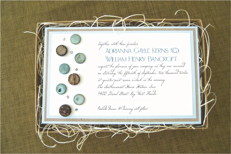
More big news!  More excitement!  Orlando Wedding magazine featured two of our Welcome Bags in the Spring/Summer 2012 issue, out on newsstands right now.  As the article says, welcome bags are a fantastic surprise for out-of-town guests to find in their hotel rooms.

Celadon green and tangerine, hot pink and emerald green wedding welcome bags


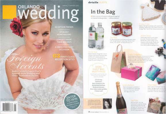
Our welcome bag, featured on the left, was created with a Kraft paper gift bag with twisted handles.  It was stenciled along both sides with a celadon green peacock feather.  A square tag, printed on cream, is attached with a tangerine orange ribbon.  A closing clasp is created for this bag using jute twine that loops around the welcome bag tag.

Our welcome box, featured on the right, is a custom-created hot pink box.  It is adorned with white ruffle ribbon and emerald green satin ribbon.  A white faux chrysanthemum sits on top of the box and holds in place a round welcome tag, printed on pearlized white and adorned with two Swarovski crystals.

Have you been scouting for unique welcome bags for your out-of-town wedding guests?  What are you planning to include in your welcome bags?  Contact us at Dogwood Blossom Stationery to begin custom-creating your welcome bags!

{News} We've been featured in BRIDES magazine!

Big news!  How exciting!  What an honor!  Our plum and jade sequin wedding invitation was featured in the January 2012 issue of BRIDES magazine!  See it online here, too.

Plum purple and jade green invitation by Dogwood Blossom Stationery, featured in BRIDES magazine Jan 2012.

This invitation is printed in purple and green on matte white, then layered onto metallic plum purple.  It uses an informal font set and a contemporary line-and-dot design on the left side.  The design on this wedding invitation is adorned with five Swarovski crystals and nine jade green sequins were sewn onto this invitation by hand.  Enclosures are printed on matte white using a coordinating purple and green line-and-dot design.  White mailing envelopes are lined with a custom envelope liner.

Plum purple and jade green wedding invitation with crystals and sequins

Plum purple and jade green wedding invitation with crystals and sequins

Sequins are hot-hot-hot right now.  Do you want your wedding invitation to contain sequin elements?

{Showcase Event} “Modern Preppy” Lime and Navy Invitations

Lime green and navy blue wedding invitation in silk box

Lime green and navy blue wedding menu and seating card

Bright green and dark blue wedding menu and escort card

Green and blue Modern Preppy tablescape

Lime and blue wedding invitation with embroidered monogram on ribbon

Modern Preppy wedding tablescape; lucite chairs

Green and blue wedding cake

Several months ago, I had the great pleasure of being asked by Karry Castillo of Uniquely Yours to create invitations and paper goods for her “Modern Preppy” tablescape (one of 3 unique themes) that she would be showcasing at the Bridal Ball held on March 2, at the Lake Mary Events Center.

As is typical for a wedding stationer, though, I didn’t have a chance to attend the actual event, and therefore wasn’t able to see how my pieces “fit” into the bigger picture.  Well, yay for photographers!  Karry kindly connected me to Chad Pilster of Pilster Photography, who sent me photos of the event.  And…  Oh.my.goodness!

I just love the vision Karry had for this tablescape!  She is so unbelievably talented and I am just so impressed by her.   So here’s the super-talented team she assembled for this particular tablescape:

Concept and design:  Uniquely Yours

Photography:  Pilster Photography

Floral design:  Lee Forrest Design

Table and chair furnishings:  AFR Room Service

Linens and tabletop decor: Kirby Rentals Orlando

Cake:  Something Sweet Cake Studio

And invitations and paper goods, you guessed it:  Dogwood Blossom Stationery & Invitation Studio

For this table, two wedding invitations were created.  The first is a square, layered invitation with two lines of white grosgrain ribbons, packaged neatly in a 100% silk box in bright lime green.  This invitation features a lime green lattice pattern, which is reflected on the inside of the coordinating wedding programs, and on some of the seating cards.

The second invitation uses a lime green and navy blue plaid pattern and features a wide, white grosgrain ribbon custom embroidered with a monogram in navy blue thread.  The plaid pattern on this invitation was also carried through to the program and escort cards.

Thanks Karry, for letting me be part of this event!

{Invitation Inspiration} Aqua Blue + Slate Gray Banded Wedding Invites

Aqua blue and slate gray wedding invitation with custom liner


Turquoise blue and dark gray wedding invitation with crystals

Aqua blue and slate gray banded wedding invitation with crystals

I’ve been getting into gray lately.  It pairs so well with just about all other colors, and is a softer touch than black.  This invitation is part of  a sample set I created for a recent client, with some color changes.

While the aqua blue, slate gray, and pearlized ivory color scheme is unique and beautiful enough, this invitation also has bunches of other features I want to discuss.  The first would be the band on the back to hold enclosures in place.  Banded invitations are a great alternative to pocket invitations for brides who want a flat invitation (versus folding), but still want a way of keeping their enclosures neatly organized.  They’re also a more economic alternative to pocket invitations for brides who choose to spend less.

Next, I’ve had lots of clients ask for custom envelope liners, lately.  I love them!  I think they add so much to the overall invitation, and give extra strength and weight to single mailing envelopes.  Additionally, some of my clients have been doing really unique things with their custom liners.  One client emphasized her wedding date on her save-the-date liner.  Another client used it as “the perfect spot” for her wedding website address.  We used repeating lines of the couples’ names on another liner.  And other clients have just used the liner to echo or enhance the graphics or color of the invitation itself.  The best part: envelope liners are a fairly inexpensive option that adds a lot of oomph to your wedding invitation!

Crystals have been another repeated trend for my clients this year.  So on this sample, I used 6 Swarovski crystals to embellish the printed design.  Crystals are another fairly inexpensive option for wedding invitations.  They come in such a wide variety of colors, shapes, and sizes that they can be incorporated into just about any style of invitation.

So now back to the possibilities with gray…  Consider the same invitation with the same design as in the photos above using lilac purple as the accent instead of aqua blue.  Now envision a light rose pink instead of aqua blue.  Pumpkin orange with gray would make a really beautiful fall wedding invitation, don’t you think?  Add black in place of the aqua and this invitation becomes so sophisticated, it hurts.  Using red and gray printed on pearlized white instead of pearlized champagne would make a gorgeous, snowy, winter invitation.  And using lime green with this shade of gray on bright matte white paper would be fresh and clean; a totally different feel altogether.

Yes, I’ve decided I really like gray!

Invitation: Dogwood Blossom Stationery & Invitation Studio, LLC

{Real Event} Blue and Yellow Polka-Dotted Fundraising Dinner Invitations

Blue_Yellow_Gray_Invitation

Navy blue and banana yellow invitation with gray ribbon

Whew, it’s been quite a month!  Things are starting to fall into a more manageable pace again.  I’ve been dying to update this blog, so I’m going to start with one of my more recent projects – fundraising dinner invitations for the Gaining Life Initiative Foundation (GLI).

GLI is focused on increasing knowledge and supporting research of brain tumors, specifically glioblastoma multiforme.  In collaboration with the University of Alabama Birmingham, they’re hoping to find a cure for this aggressive brain tumor.

I was so excited when GLI contacted me about working with them on this project.  Their needs for their Dining Out for a Cure fundraising event were fun invitations in a dark blue and bright yellow color scheme that incorporated a gray Brain Cancer ribbon.  You might remember Rita and Franck’s wedding invitation?  And you might also remember the yellow and gray polka-dot inspiration post?  Well, combine those two and add a hand-sewn gray ribbon and what do you have?  The perfect invitation for GLI’s Dining Out for a Cure event!  Take look at their website and tell me if I’m wrong.

We created a layered invitation using textured sapphire blue cardstock, bright banana yellow cardstock, and bright white.  We then added a few lines of yellow polka-dots at the bottom, the GLI logo, and a hand-sewn light gray ribbon.  We added an rsvp card that allowed guests to send a check if they weren’t able to attend the event.  The goal was to create an invitation that left donors counting the days until the event, and to create excitement about and interest in the research GLI is conducting.

Thanks GLI for letting me be a part of your fundraising event!

If you’re interested in supporting this important cause, you can make contributions on their website here.

Fundraising Invitation: Dogwood Blossom Stationery & Invitation Studio

{Fun} Business Card Love

Fabric wedding stationer business cardsFabric wedding stationer business cards

Several posts ago, I discussed the joys of using fabric on wedding invitations.  I also told you at that time that I was super excited about my new business cards – which also use fabric – and that I would share them with you here someday.  Well, the day has come!

I’m super-excited to share my new business cards with you!  They are printed on toothy bright white paper and bonded to a really great white cotton canvas fabric screenprinted with a black lattice pattern.  The corners are rounded to give them an extra touch of detail.  These new cards are super thick, weighty little things, and they bring me great joy whenever I grab for one.  Trust me, they’re a keeper.  (wink)

I really love my new cards and I feel like they fit my style better than my previous cards, which were printed on a creamy pearlized cardstock.  Though many people complimented them, I just felt like they didn’t get the message across of what I “do” – which is: I take invitations and paper goods to a totally different level by stepping out of the realm of paper alone, and by incorporating dimensional elements that make things really pop.

Color.  Embellishment.  Dimension.  That’s what Dogwood Blossom Stationery is all about.

{Advice} Strategy for Writing Thank You Notes

Salmon Pink and Light Oatmeal Thank You Card

So the celebration is over and you’ve had your first non-planning weekend in months!  Yay!  You’ve got one final task at hand, though, and you might be thinking it’s the most daunting: writing thank yous for those fabulous wedding gifts you received…

Don’t fret!  With a little time and with a strategy on hand, writing thank you notes can become very easy.  Don’t over-think it; be sincere and grateful.  Remember, a thank you note need not be longer than a paragraph.

Some easy guidelines:

  • Introduction: Say thank you and state (specifically) what you’re thanking them for:
    • (Wrapped gift) “Thank you for the beautiful Waterford vase.”
    • (Registry contribution) “Thanks so much for contributing to our honeymoon registry.”
    • (Cash) “Thank you for your generous wedding gift.”
  • Body: Give them some details about how you will/are using the gift (shoot for 2 to 3 sentences):
    • “The vase looks great on the mantle filled with fern fronds. It matches our décor perfectly.”
    • “We had a great time scuba diving in Bermuda; the water was perfect.”
    • “We’re planning to use the money towards a down payment on our first house!”
  • Closing: Reiterate your gratitude that they shared your day, and let them know they’re an important part of your life:
    • “We’re so happy that you made it to South Dakota for our wedding.  It was so great to see you both.”
    • “Every time we look at our honeymoon album, we’ll think of you.  We had a great time!”
    • “We’ll let you know when we finally find the perfect place; we’d love to have you visit.”

Hot tips:

DEFINITELY hand write a genuine, short thank you note in a timely manner.  Try to mail your thank yous within 3 months of your event.

DO get creative in finding time to write your notes, if needed. Bring a copy of your gift list and a small stack of thank you cards with you anywhere you might have to wait: the doctor’s office, the airport, even waiting on hold on the phone. It only takes two to three minutes to write one thank-you; you can squeeze five notes into a fifteen-minute wait.

Brides, DO enlist the new hubby.  Assign him half the list and hand him the above guidelines.  Even if he refuses to write the note itself, it’s often nice if each note contains his true signature.

DON’T create an “all-purpose template” for your thank you notes. Canned and generalized thank yous are not only obvious and insincere, but can feel worse than not receiving a thank you at all.  Be specific and personalize each note.

DON’T stress over your handwriting! Do your best to make the note legible, but don’t ever use bad handwriting as an excuse to not send a thank you.

Good luck writing!


The folding thank  you card in the photo above was created using light oatmeal and salmon pink cardstock.  Inside, the card is lined with a white writing liner.

Thank You Card: Dogwood Blossom Stationery & Invitation Studio, LLC

{Invitation Inspiration} Soft Aqua Blue Driftwood Wedding

Soft Bue Driftwood Wedding Invitation
Aqua blue wedding program and favor tag
Blue and Brown Driftwood Wedding Invitation
Boxed wedding invitation with shell and wood beads

Soft sand, warm light, the gentle sounds of waves lapping the shore and gulls in the distance…  Just those thoughts alone cause me to close my eyes, sigh deeply, and relax a bit.

I’ve been wanting to do something with a more natural theme, lately.  A number of recent clients have used trees on their invitations, so I guess that’s why I’ve been leaning towards nature.  Plus, the weather is getting nicer and I’ve been spending more time outdoors!  (Not that the weather isn’t pretty good year-round here in Florida!)  Last weekend, I had the pleasure of spending an afternoon at the Canaveral National Seashore – my favorite beach that I happily live very near.  So I created the invitation above with a beach wedding in mind.

This boxed invitation is 5.5” x 8.5” with multiple layers of pearlized soft sky blue papers, light flecked oatmeal paper, and soft creamy white paper.  I hand-sewed aqua shell and hand-carved wood beads onto the invitation, and added a sprinkle of Swarovski crystals.  It arrives in a kraft brown box filled with natural wood excelsior (curled wood shavings), and the enclosures are contained in a band affixed to the lid of the box.  A bright aqua blue satin ribbon holds the box closed during mailing, and a custom label tops it all off.  Perfect for a fabulous beach wedding, wouldn’t you say?

Also shown is a flat bonded ceremony program and a round favor tag tied to a corked glass bottle, both designed to coordinate with the invitation.

Invitation: Dogwood Blossom Stationery & Invitation Studio, LLC

{Invitation Inspiration} Fun with Gingham

Gingham wedding invitation in black, hot raspberry, and lemon yellowGingham place-setting menu in black, hot pink, and yellowGingham fabric wedding invitation

Last year around this time, a bride called and asked me to create an invitation using bandana fabric.  To date, it’s one of my favorite projects, and I have her invitation posted in my Weddings Gallery and on lots of other online galleries!  Part of the reason why her wedding ensemble is one of my favorite projects is that when she asked me to use fabric, my first instinct was to panic.  Using fabric on invitations was new for me, and I didn’t really know where to begin.  But I told her I’d try it out and see what happened.  Well, the results were amazing!  That bride opened a whole world of opportunities for me!

Since creating her wedding invitations, I’ve created many, many more invitations using fabrics, for various events and occasions, and have actually decided to layer my business cards onto fabric.  (Yes, it’s just that great.)  (I’ll post my new business cards on this blog at a later date so you can see just how incredible they are – I dare you to throw my business card away!)

So on my last trip to the fabric store, I saw black and white gingham, and this little lightbulb went off in my head.  Wouldn’t that look awesome with some bright colors – like hot pink and bright yellow?  Maybe with a fluffy bow?  Something super fun…  Perfect!

The result is what you see above.  I created a square, gate-fold invitation using hot raspberry pink cardstock and tied it closed with a fluffy satin ribbon in lemon yellow.  Inside, the invitation is printed on bright white in a casual handwriting font paired with a formal block font.  A layer of black and white gingham sets off the invitation with unexpected flair.

To demonstrate how the look comes together at the reception, I created place-setting menus using the same materials, designed to slide into a pocket-fold napkin.

Also while I was at the fabric store, I saw some light blue and white gingham… it would look great on a birth announcement…  Hmmm.

Invitation & Menu: Dogwood Blossom Stationery