{Inspiration} A Candy Land Wedding

Still searching for the perfect wedding theme that says colorful, fun, and personality all in one? Why not take a walk down memory lane? Or more specifically, a walk through Candy Land.

Recently, Dogwood Blossom Stationery worked with Flaire Weddings and Events at Winterbourne on the St. Johns to bring to life with the help and amazing talents of  Corinna Hoffman Photography an exciting and fresh Candy Land theme that’s sure to get your guests talking for years to come.

Candy Land themed weddings

Candy Land themed wedding invitations

Candy land themed wedding invitations Dogwood Blossom Stationery

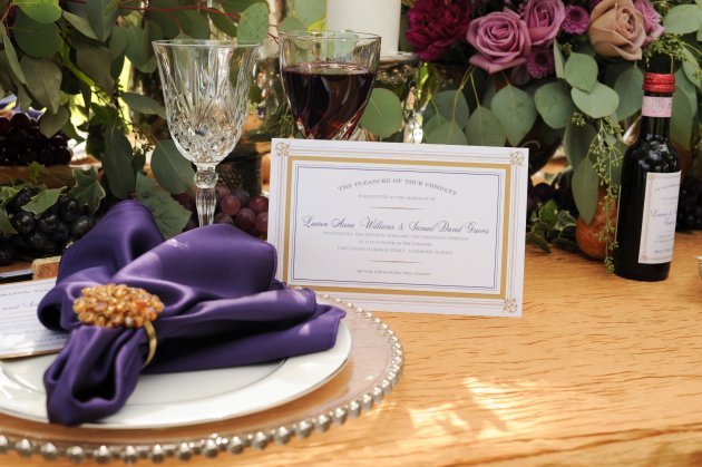
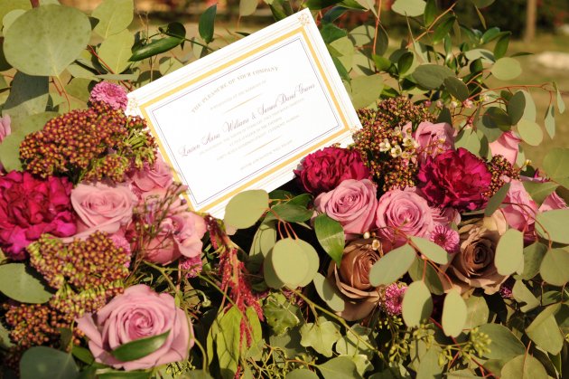
The wedding invitations stand out in a blush and spearmint striped pattern just like the popular mints—and are embellished with satin ribbon and playfully romantic font to evoke both delicacy and a sense of royalty.

After all, the bride and groom aren’t just any newlywed couple in the world of Candy Land! They have respectively become the board game’s popular royal characters: Queen Frostine and King Kandy, as designated by their festive chair back signs, which are embellished with satin blush bows and outlined in the colorful Candy Land pathway players traverse in the game.

Candy land themed wedding

Candy land themed wedding

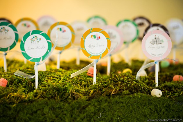
But it doesn’t end there. Guests are actively involved in the Candy Land theme as well. Escort cards are transformed into lollipops, each bearing the guest’s name as well as the Candy Land location their table represents: Candy Castle, Lollipop Woods, Gumdrop Mountains, Peppermint Forest, and more.  Custom motifs were created for each magical location and reflected on the table numbers as well.  It’s a refreshing way to revamp traditional table numbers and bring the excitement back into celebrating your wedding!

Candy land themed wedding table cards

__Corinna_Hoffman_Photography_Candy Land wedding Dogwood Blossom Stationery 15

Candy land themed wedding

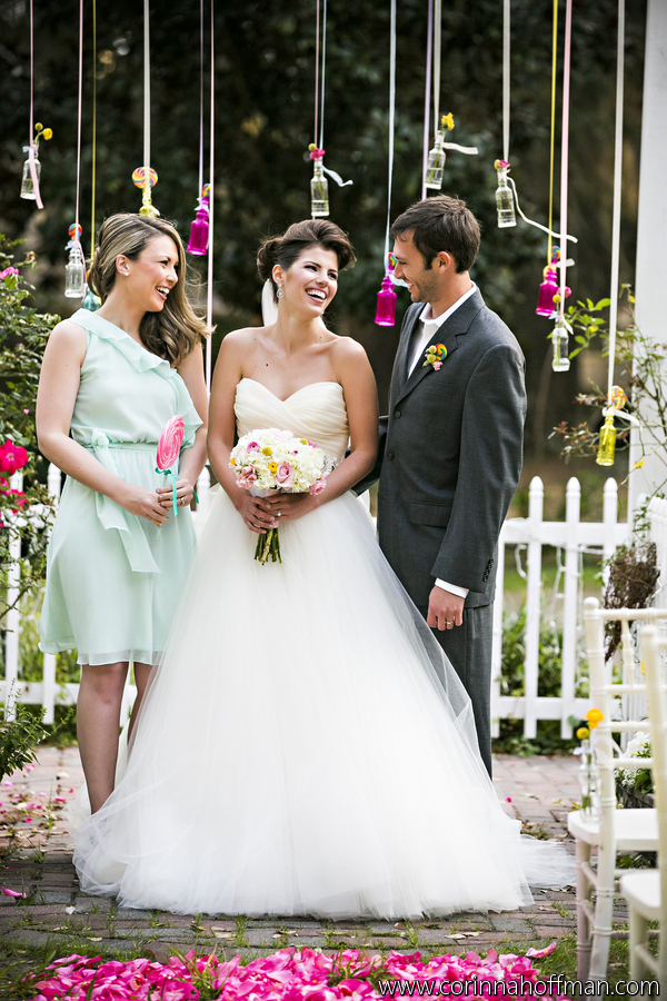
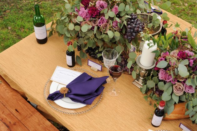
Once at their table, guests are greeted with a palette of delightful pastels that effectively transform them into a whole new world, thanks to the imaginary design concepts of Flaire Weddings and Events.

Candy land themed wedding table top decor__Corinna_Hoffman_Photography_Candy Land wedding Dogwood Blossom Stationery 13

Candy Land themed wedding floral decor

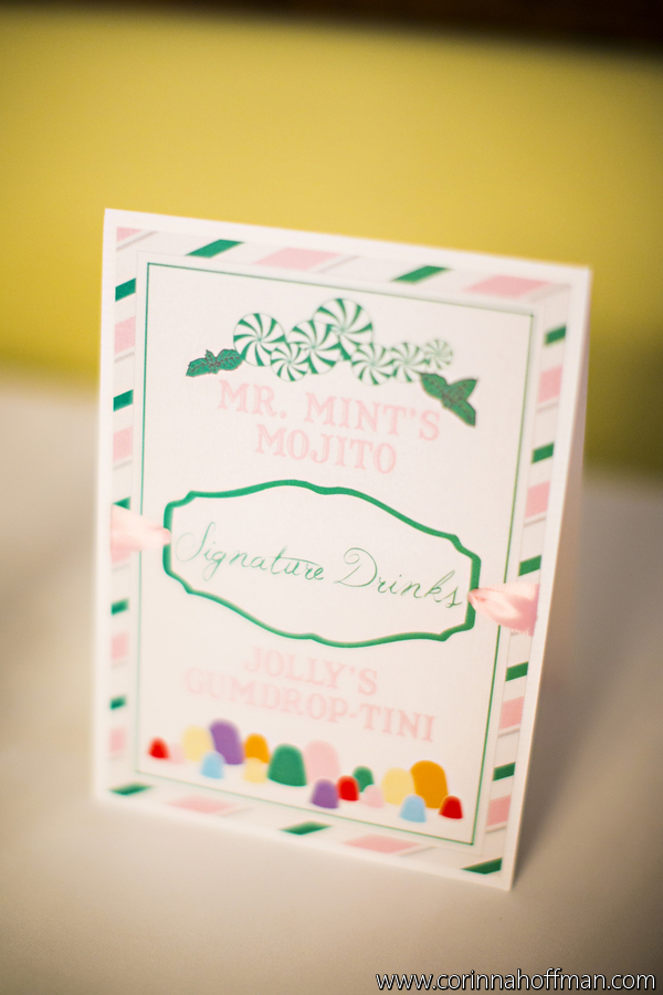
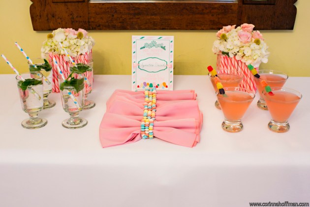
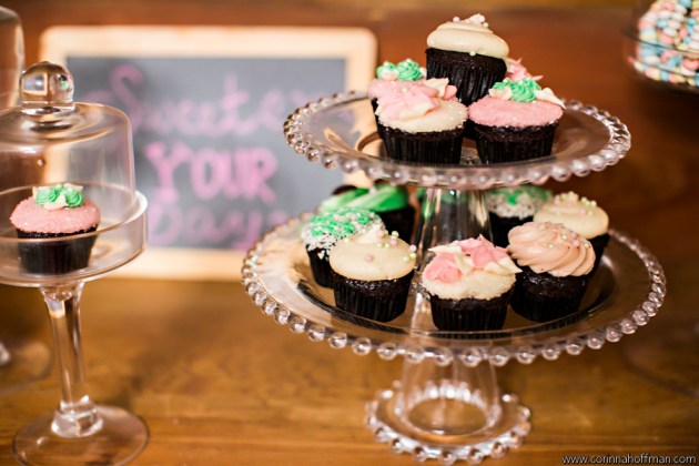
Lastly, what’s a wedding reception without drinks and desserts? Here, our coordinating peppermint signature drink signage announces Mr. Mint’s Mojito’s, complete with martinis that have gumdrops for stirrers.

Candy land themed wedding signature drink

Candy land themed wedding signature drinks

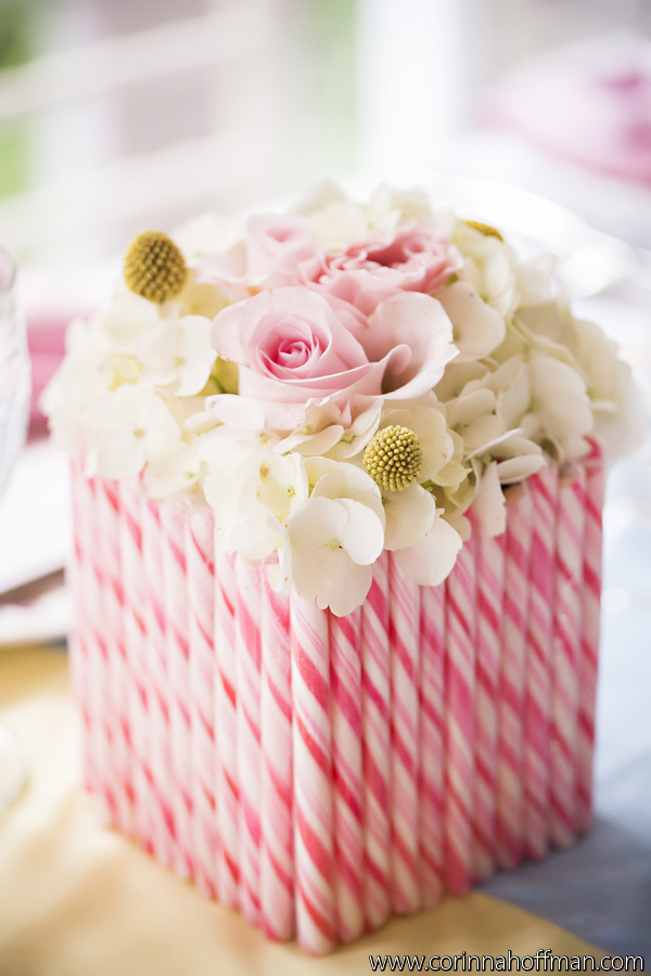
The dessert buffet adds one final splash of color (and sweetness) for this Candy Land wedding. Delicious cupcakes by Sweet By Holly and matching confectionaries made this candy bar a beautiful compliment to  end the wedding on a sweet note.

Candy land themed wedding candy bar

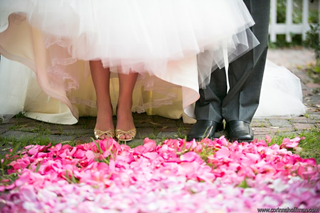
The aisle runner designed by  Blossoms & Accents, Inc. took buckets, upon buckets of rose petals to re-create the magical and vibrant look seen here:  

Candy land themed wedding outdoor Florida weddings

Candy land themed wedding Florida outdoor weddings

Candy land themed wedding Florida outdoor weddings

Candy land themed wedding Florida outdoor weddings

Candy land themed wedding Florida outdoor weddings

Love is sweet. So why should your wedding be any different? Go ahead. Sweeten the biggest day of your life.

Candy land themed wedding florida weddings

Invitations, escort cards, and other paper goods were all designed by Dogwood Blossom Stationery & Invitation Studio. Contact us to schedule a design consultation for your custom event!

As always, we couldn’t make wedding dreams come true without the amazing support and contribution from other vendors:

Venue – Winterbourne Inn on the St. Johns

Photography – Corinna Hoffman Photography

Makeup – Artistry By Erin

Bridesmaid Dress – Bella Bridesmaid Jacksonville

Florals – Blossoms & Accents, Inc.

Large Cake – Choux Designer Cakes

Invitations & Paper Goods – Dogwood Blossom Stationery & Invitation Studio

Planning, Design, and Coordination – Flaire Weddings and Events

Makeup – Makeup by Paulina Perez

Cupcakes – Sweet By Holly

Bridal Gown – The White Magnolia, Bridal Collection

Video – Visual Power Cinema

{Inspiration} Vineyard-Inspired Weddings

Vineyard-Inspired Weddings

A vineyard can be the perfect setting for any wedding, especially with our custom-made, vineyard-inspired wedding paper goods. The color combination of plum purple and gold beautifully accents the scenery, making it the optimal place for any outdoor wedding. This photo shoot captured by Tod Thompson Photography showcased every detail, from the invitations to the floral arrangements.

Vineyard-Inspired Weddings

Vineyard-Inspired Weddings

Vineyard-Inspired Weddings

The wine label-inspired, layered wedding invitations feature an intertwining gold design with corner accents surrounding a solid gold band, highlighting the purple print inside. The white mailing envelope is lined with a matching purple envelope liner. Don’t they pair exquisitely with the floral arrangements from Peplum Events & Design?

Vineyard-Inspired Weddings

Vineyard-Inspired Weddings

Custom wine bottle labels are a must for a vineyard wedding, making the bottles wonderful wedding favors for your guests to remember your special day. The labels are designed to coordinate with the invitations, with a matching intertwining gold design, and can be made for both regular and mini wine bottles. In this shot, Save the Date Wedding & Event Design brought the winery to the table with their elegant “vineyard chic” tabletop design.

Vineyard-Inspired Weddings

Wine cork escort cards are a splendid seating choice for a winery wedding. Each escort card features a gold double-pinstripe border printed on pearlized white and layered onto plum, and a cork escort card holder to tie everything together. These escort cards can add a fun and rustic feeling to your wedding!

Vineyard-Inspired Weddings

Vineyard-Inspired Weddings

Isn’t the bride radiant in her dress from Modern Bridal? Her dress, along with the white wooden church pews from A Chair Affair and barrels from Lakeridge Winery, helped transport the scene to a country vineyard in Italy.

Vineyard-Inspired Weddings

Vineyard-Inspired Weddings

Are you dreaming of a vineyard wedding? Consider a vineyard-inspired event for a unique and natural approach to your special day. What was your favorite accent featured here?

All wedding invitations, labels, and escort cards shown are designed and produced by Dogwood Blossom Stationery. Contact us to schedule a design consultation for your custom vineyard event!

Thank you to all the event professionals who made this photo shoot possible:

Photography: Tod Thompson Photography

Videography: Dream Vision Pictures

Planner & Design: Save the Date Wedding & Event Design

Floral: Peplum Events & Design

Farm Tables, Church Pews, Chargers: A Chair Affair

Cake: Sweet Lola Cake Pops

Dress: Modern Bridal

Décor: Swag Decor

{Inspiration} Yellow and Graphite Damask Wedding Suite

Yellow and graphite damask wedding invitation, menu, table number, and escort cards

Yellow and graphite damask wedding invitation
Yellow and graphite damask wedding reception menu, table number, and escort cards

Yellow + gray is such a versatile color combination, both in terms of formality and season.  It is equally appropriate for an informal backyard summer wedding as it is for a black-tie ballroom wedding in January.  The tricks to this color scheme in tending it one way or the other are your choice of graphic design, wording layout (as well as wording itself), and typestyle.

The above paper suite contains a simple, pocket-style wedding invitation of graphite accented with a yellow damask fixed band with Swarovski crystals.  The invitation is printed on white with a yellow damask backing.  The white mailing envelope is lined with a matching custom yellow damask envelope liner.

The escort cards above have two colors to indicate meal option at the reception – gray damask is one entrée, yellow damask is the other.  All escort cards contain crystals as well.

The wedding menu above doubles as a table number and is three-sided, self-standing, printed fully in yellow damask, with table number and menu information on all three sides.

Yellow and Stone Gray Polka Dot Boxed Wedding Invitation with hand-sewn fabric flower

Yellow, gray, and white polka dot escort cards for wedding

And here, we have another example of yellow and gray wedding papers – a wedding invitation in a suede-like gray fabric box.  The box is adorned with a wide, bright yellow grosgrain ribbon and a hand-sewn flower made with yellow striped cotton fabric.  The invitation itself has yellow polka dots.

The seating cards for this invitation are double-sided and mimic the yellow polka dots from the invitation.  Guests’ names are printed on one side, and their table number is shown on the back.

For more yellow and gray wedding inspiration, visit my Pinterest board here.

All invitations, escort cards, menus, and table numbers shown are created by Dogwood Blossom Stationery.  Contact us to schedule a design consultation for your custom yellow and gray event!

{Inspiration} Sequins – More sequined wedding invitations

Eggplant purple wedding invitation with sequins

Sequins are hot right now.  They’re everywhere.  While prior to 2011 most of us might have remembered them mostly as adornment on our gymnastics and dance leotards from childhood (I remember!), they were rethought last year as a hot embellishment for literally just about everything – couture runway gowns, home décor, hair accessories, you name it.  The wedding industry was certainly not left out of that trend, as you are probably already very aware.  And it’s a good thing, because sequins can do marvelous things for your wedding’s overall look and style, and they’re actually much more versatile than most of us give them credit for.

BLING – Used in large quantities and metallic colors,  sequins provide a lot of bling to whatever item it is they’re embellishing.  Consider adding crystals to boost the bling.

VINTAGE GLAMOUR – Used in delicate, pale, or washed-out hues like champagne, peach, or light gray, they lend a vintage glam look.  Perfect for weddings with a vintage Hollywood theme.

WILD FUN – In bright or hot colors, sequins add fun to their platform.

SOPHISTICATION – And used sporadically, in smaller quantities and rich colors, they add elegance, dimension, and intensity of color as they reflect the light they catch.

Pale gold and blush pink wedding menus with sequins


We created the wedding invitation at the top of this post using a suede-like aubergine purple fabric, embroidered with an undulating wave pattern and embellished with matching eggplant-colored sequins.  This wedding invitation is more sophisticated than it is blingy as a result of the rich purple hue and the relatively minimized use of sequins.  If you could only reach through the screen and touch it, you would find this invitation incredibly tactile and warm, thanks to the soft faux suede fabric and raised embroidered waves.

We created the place-setting menus above using cream-colored papers printed in chocolate brown.  Blush pink sequins and tiny, clear glass beads were sewn into a twist of pale gold mesh fabric as an embellishment.  These menus have a vintage feel with the slightest hint of glam.

What’s your take on sequins?  Will you incorporate them into your wedding style?  Contact us at Dogwood Blossom Stationery to schedule a design consultation to discuss your custom sequin wedding invitations.

{Invitation Inspiration} Aqua Blue + Slate Gray Banded Wedding Invites

Aqua blue and slate gray wedding invitation with custom liner


Turquoise blue and dark gray wedding invitation with crystals

Aqua blue and slate gray banded wedding invitation with crystals

I’ve been getting into gray lately.  It pairs so well with just about all other colors, and is a softer touch than black.  This invitation is part of  a sample set I created for a recent client, with some color changes.

While the aqua blue, slate gray, and pearlized ivory color scheme is unique and beautiful enough, this invitation also has bunches of other features I want to discuss.  The first would be the band on the back to hold enclosures in place.  Banded invitations are a great alternative to pocket invitations for brides who want a flat invitation (versus folding), but still want a way of keeping their enclosures neatly organized.  They’re also a more economic alternative to pocket invitations for brides who choose to spend less.

Next, I’ve had lots of clients ask for custom envelope liners, lately.  I love them!  I think they add so much to the overall invitation, and give extra strength and weight to single mailing envelopes.  Additionally, some of my clients have been doing really unique things with their custom liners.  One client emphasized her wedding date on her save-the-date liner.  Another client used it as “the perfect spot” for her wedding website address.  We used repeating lines of the couples’ names on another liner.  And other clients have just used the liner to echo or enhance the graphics or color of the invitation itself.  The best part: envelope liners are a fairly inexpensive option that adds a lot of oomph to your wedding invitation!

Crystals have been another repeated trend for my clients this year.  So on this sample, I used 6 Swarovski crystals to embellish the printed design.  Crystals are another fairly inexpensive option for wedding invitations.  They come in such a wide variety of colors, shapes, and sizes that they can be incorporated into just about any style of invitation.

So now back to the possibilities with gray…  Consider the same invitation with the same design as in the photos above using lilac purple as the accent instead of aqua blue.  Now envision a light rose pink instead of aqua blue.  Pumpkin orange with gray would make a really beautiful fall wedding invitation, don’t you think?  Add black in place of the aqua and this invitation becomes so sophisticated, it hurts.  Using red and gray printed on pearlized white instead of pearlized champagne would make a gorgeous, snowy, winter invitation.  And using lime green with this shade of gray on bright matte white paper would be fresh and clean; a totally different feel altogether.

Yes, I’ve decided I really like gray!

Invitation: Dogwood Blossom Stationery & Invitation Studio, LLC

{Invitation Inspiration} Soft Aqua Blue Driftwood Wedding

Soft Bue Driftwood Wedding Invitation
Aqua blue wedding program and favor tag
Blue and Brown Driftwood Wedding Invitation
Boxed wedding invitation with shell and wood beads

Soft sand, warm light, the gentle sounds of waves lapping the shore and gulls in the distance…  Just those thoughts alone cause me to close my eyes, sigh deeply, and relax a bit.

I’ve been wanting to do something with a more natural theme, lately.  A number of recent clients have used trees on their invitations, so I guess that’s why I’ve been leaning towards nature.  Plus, the weather is getting nicer and I’ve been spending more time outdoors!  (Not that the weather isn’t pretty good year-round here in Florida!)  Last weekend, I had the pleasure of spending an afternoon at the Canaveral National Seashore – my favorite beach that I happily live very near.  So I created the invitation above with a beach wedding in mind.

This boxed invitation is 5.5” x 8.5” with multiple layers of pearlized soft sky blue papers, light flecked oatmeal paper, and soft creamy white paper.  I hand-sewed aqua shell and hand-carved wood beads onto the invitation, and added a sprinkle of Swarovski crystals.  It arrives in a kraft brown box filled with natural wood excelsior (curled wood shavings), and the enclosures are contained in a band affixed to the lid of the box.  A bright aqua blue satin ribbon holds the box closed during mailing, and a custom label tops it all off.  Perfect for a fabulous beach wedding, wouldn’t you say?

Also shown is a flat bonded ceremony program and a round favor tag tied to a corked glass bottle, both designed to coordinate with the invitation.

Invitation: Dogwood Blossom Stationery & Invitation Studio, LLC

{Invitation Inspiration} Fun with Gingham

Gingham wedding invitation in black, hot raspberry, and lemon yellowGingham place-setting menu in black, hot pink, and yellowGingham fabric wedding invitation

Last year around this time, a bride called and asked me to create an invitation using bandana fabric.  To date, it’s one of my favorite projects, and I have her invitation posted in my Weddings Gallery and on lots of other online galleries!  Part of the reason why her wedding ensemble is one of my favorite projects is that when she asked me to use fabric, my first instinct was to panic.  Using fabric on invitations was new for me, and I didn’t really know where to begin.  But I told her I’d try it out and see what happened.  Well, the results were amazing!  That bride opened a whole world of opportunities for me!

Since creating her wedding invitations, I’ve created many, many more invitations using fabrics, for various events and occasions, and have actually decided to layer my business cards onto fabric.  (Yes, it’s just that great.)  (I’ll post my new business cards on this blog at a later date so you can see just how incredible they are – I dare you to throw my business card away!)

So on my last trip to the fabric store, I saw black and white gingham, and this little lightbulb went off in my head.  Wouldn’t that look awesome with some bright colors – like hot pink and bright yellow?  Maybe with a fluffy bow?  Something super fun…  Perfect!

The result is what you see above.  I created a square, gate-fold invitation using hot raspberry pink cardstock and tied it closed with a fluffy satin ribbon in lemon yellow.  Inside, the invitation is printed on bright white in a casual handwriting font paired with a formal block font.  A layer of black and white gingham sets off the invitation with unexpected flair.

To demonstrate how the look comes together at the reception, I created place-setting menus using the same materials, designed to slide into a pocket-fold napkin.

Also while I was at the fabric store, I saw some light blue and white gingham… it would look great on a birth announcement…  Hmmm.

Invitation & Menu: Dogwood Blossom Stationery

{Invitation Inspiration} Mixing Formal & Fun

Black and fuchsia square wedding invitation in slimline mailing boxBlack and fuchsia square wedding invitation in slimline mailing boxBlack and fuchsia square wedding invitation in slimline mailing box

Several weeks ago, I met with a new client for a design consultation, and she was in a conundrum.  Her wedding is going to be very formal, but she really wants an invitation filled with color and printed with her wedding motif.  She was concerned that a colorful, highly designed invitation would not convey the formality of her wedding.

While it is true that in days past formal invitations were very straightforward – black text printed on white or ivory cards with few accents or design work – that isn’t the case today.  Formal invitations can be just about anything you want them to be.  However, there are a few guidelines that will help your guests understand that your event will be formal.

TYPESTYLE

Typestyle can be the first indication of what to expect at an event.  While there aren’t hard-and-fast rules, and anything is possible within the world of design, here are a few tips for choosing the typestyle of your invitation.

Serif fonts (think Times New Roman-style), also called block fonts, are very traditional, and work best for very formal weddings.  Consider pairing a block font with a traditional script font and you’ve got a very classic, formal typestyle.

In the photos above, for instance, I used a classic all-caps block font with a traditional script font.  To make it more interesting, I switched the usual roles of the fonts: I used the block font for the bride and groom’s names, and the script font for the invitation text.  (Note:  When using script fonts for invitation text, be sure to choose a script that’s easy to read, and be sure to print it a little larger that you might print a block font.  Remember, one of the most important “etiquette” rules is ensuring that you make things easy for guests.  It’s not all about eye-candy!)

On the other hand, a script font that verges on modern “handwriting” tells guests that the event will be less formal, perhaps even casual.  This type of font is best used for less formal weddings, outdoor weddings, beach weddings, or destination weddings.  Sans serif fonts – those without the little nubbies on the ends of the letters (think Arial- or Verdana-style) – are also great for informal events, but depending on their usage, they can also be used for a formal wedding with a contemporary look and feel.

WORDING

Wording is the second major indicator of the formality of your wedding.  If you’re planning a formal wedding, it’s best to stick with traditional wording and leave out additional text like rhyming lines.  Also, be sure to spell out all words, even numbers, and do not use abbreviations.

Did you know that technically, wording varies based on whether you’re being married in a religious setting.  For instance, if you’re being married in a church, the wording: “requests the honour of your presence” is appropriate.  If you’re having a civil ceremony, the wording: “requests the pleasure of your company” is appropriate.

For less formal wedding invitations and casual invitations, wording can literally be whatever you’d like it to be, as long as the who, what, when, where, why information is being given.  Abbreviating dates is perfectly acceptable if you choose to do so, and will often help convey the fun and casual nature of your event.

ADDITIONAL LINES

If your event is black-tie, it is acceptable to print “Black tie” or “Black tie optional” in a lower corner of the invitation or below the invitation text.  Likewise, if you’re having a beach wedding and you don’t want guests wearing heels, consider printing “Casual attire” in the corner.  Doing so will give your guests official “permission” to dress down.

So… now that you have a few general guidelines, go for it – mix some fun, color, and unexpected elements into your formal wedding invitation!

And above all else, remember: the most important thing to keep in mind – not just for your invitations, but for all aspects of your event – is to make things easy and fairly obvious for guests.  Convenience and conveyance of information is the real reason behind etiquette rules, afterall.

Boxed Invitation: Dogwood Blossom Stationery & Invitation Studio, LLC

The formal wedding invitation above was created in a black and fuchsia color scheme, accented with arabesques.  It is an oversized, 8.25” x 8.25” invitation with multiple layers of textured black, toothy whites, and smooth fuchsia.  This invitation is mailed in a black slimline invitation box and will arrive to guests in stunning style.

{Invitation Inspiration} Silk & Fabric Invitation Boxes

Yellow and gray polka-dotted wedding invitation in invitation boxYellow and gray polka-dotted wedding invitation in invitation boxYellow and gray polka-dotted wedding invitation in invitation box

The two most common things I hear from my clients is that they want their invitation to make a big first impression and they want an invitation that guests will want to save as a keepsake.  There are many ways to achieve those goals, and here’s one way of sending invitations that guarantees to impress and has only the tiniest chance of ever being disposed of: the invitation box.

There are many types of invitation boxes, but today’s post is about those made with silk and fabric.  Sturdy boxes enveloped in 100% silk are the ultimate way to send luxe invitations, not only because of the natural luxury of pure silk, but also because gorgeous dimensional elements can easily be added to your wedding ensemble, such as brooches, feathers, heavy trims, lace overlays, and large crystals.  Silk invitation boxes are perfect for black tie weddings and the most luxurious of events.

But boxes aren’t just for the most poshly planned events.  Invitation boxes are made using a variety of other fabrics, like the microsuede shown in the photos above, glitter fabrics, satins, and even cottons.  So whether you’re planning an intimate garden wedding, a blingy Sweet 16, or a young man’s Bar Mitzvah, there are fabric box options for you.

And if your budget doesn’t quite permit the expense of fabric boxes, there are alternative – but just as impressive – options, such as folios, silk-covered invitation boards, and fabric invitation pouches.  I’ll be posting more about these other options over the next several weeks, so keep checking back!

The gray and yellow wedding invitation in the photos above is layered with textured whites and pearlized whites, and printed with polka dots in bright sunshine yellow.  It is placed in a square microsuede invitation box in stone gray.  This wedding invitation is mailed using a white outer mailer and custom mailing labels to coordinate with the invitation design that can be addressed by your hand or a professional calligrapher’s.

Invitations: Dogwood Blossom Stationery & Invitation Studio, LLC

{Retro-Mod} Finding Inspiration in Everyday Objects

Red Retro-Mod Wedding Invitation
Red and white retro-mod dot-and-line pattern
Punch cup with retro-mod design

Today I wanted to write about finding inspiration in everyday objects.  When I speak with new clients, I always ask them to send me “inspiration” for their invitation.  I tell them to show me photos, designs, motifs, and styles that appeal to them.  This inspiration is so important in helping me get to know my clients and understand their taste preferences!

Anyone who knows me well knows that I collect glassware.  I like it all, from expensive cut crystal to cheaply etched brandy snifters.  As long as it’s something you don’t see everyday (or anymore), I crave it.  Thrift stores and flea markets are great places to find these poor little cast-off glasses that I find so intriguing.  Recently, at a flea market, I found a set of these retro-mod punch cups.  They have tiny little round handles and a white painted-on pattern of lines and dots.  I fell in love with them, instantly.

Earlier this week I was admiring my mishmash collection of glassware and my little punch cups stood out.  I decided to use them as an example of finding inspiration in everyday objects, and I created a simple invitation based on their retro-mod pattern.  It would be so easy to create an entire wedding suite using this design in white and bold red.  I can easily see a table with lines of seating cards, each one coordinating perfectly with the invitation; white favor boxes containing truffles, wrapped in paper bands printed with the same red mod pattern; matching menus at each place setting would add instant (and easy) color to tables, and red textured thank you cards adorned with dots and lines would round-out this wedding suite perfectly…  All this from a punch cup I picked up at a flea market!

I wonder what you have – in your life, your collections, your living space, your imagination – that would make great inspiration for an invitation design.  I hope you’ll share your thoughts with me!